 English
 Français
Why Pastel Colors Work Wonders in Home Decor
Pastel color schemes have become a go-to choice for homeowners and designers seeking a blend of elegance, calmness, and visual charm. Defined by their soft, muted tones—like powder blue, blush pink, mint green, and lavender—pastel colors evoke feelings of serenity while offering a modern, fresh aesthetic. Whether used as a subtle accent or as the main palette in a room, pastels bring a light and airy atmosphere that feels both contemporary and timeless.
Their popularity is not just a passing trend. From Scandinavian interiors to minimalist spaces and romantic French-inspired homes, pastel hues have proven their versatility across styles. They work exceptionally well in small spaces, reflecting light and creating the illusion of openness. It’s no surprise that #pastel has become a viral visual language across platforms like Instagram and Pinterest.
At WeFixPix, we understand the visual power of pastel colors—especially in real estate photography. That’s why we offer virtual home staging services that can transform ordinary property photos into stunning, pastel-toned spaces that speak to today’s homebuyers. Whether you’re selling an empty apartment or marketing a cozy family home, we can help you stage it digitally with calming pastel accents that elevate appeal and increase click-through rates.
Let’s explore how you can bring the beauty of pastel color into your home decor—both in real life and through professional photo editing.
10 Beautiful Ways to Decorate Your Home with Pastel Colors
Decorating with pastel color tones doesn’t mean turning your home into a candy shop. On the contrary, when used thoughtfully, pastels bring a refined softness, light, and charm that suits a variety of interiors—from modern and minimalist to vintage or coastal chic. Below are 10 beautiful and practical ways to introduce pastel colors into your home decor.
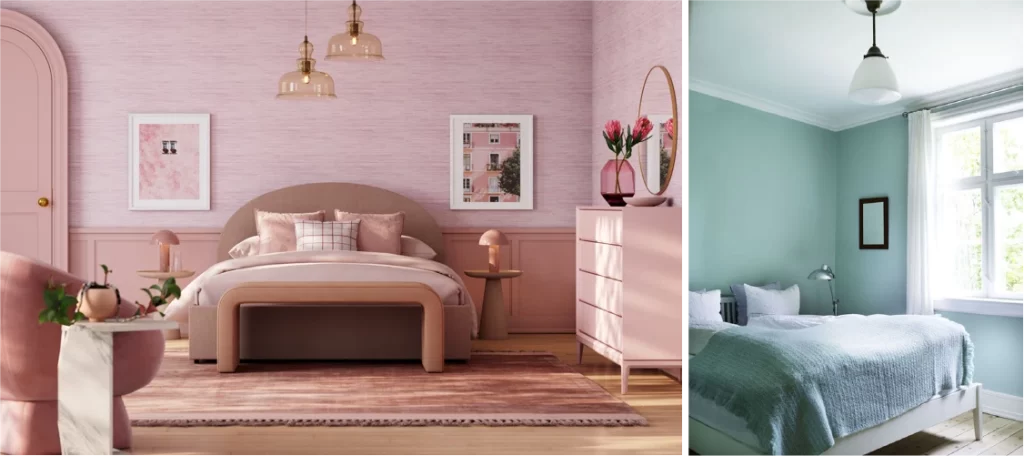
1. Start with Pastel Walls
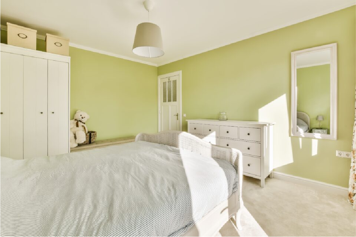
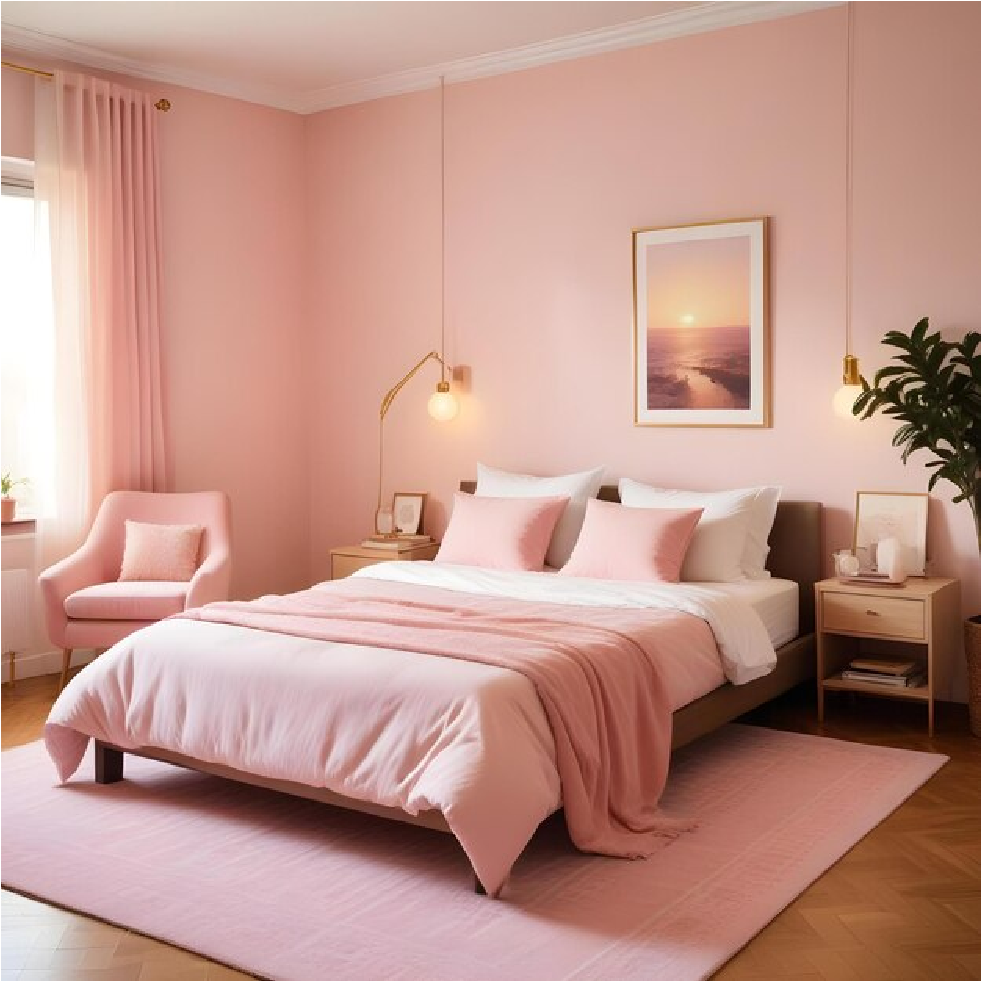
A fresh coat of pastel paint can instantly refresh a room. Soft pink, baby blue, or muted mint on the walls creates a soothing backdrop that pairs well with both light and dark furnishings. Pastel-colored walls are especially effective in bedrooms, nurseries, and home offices where calmness is key.
2. Incorporate Furniture with Pastel Colors
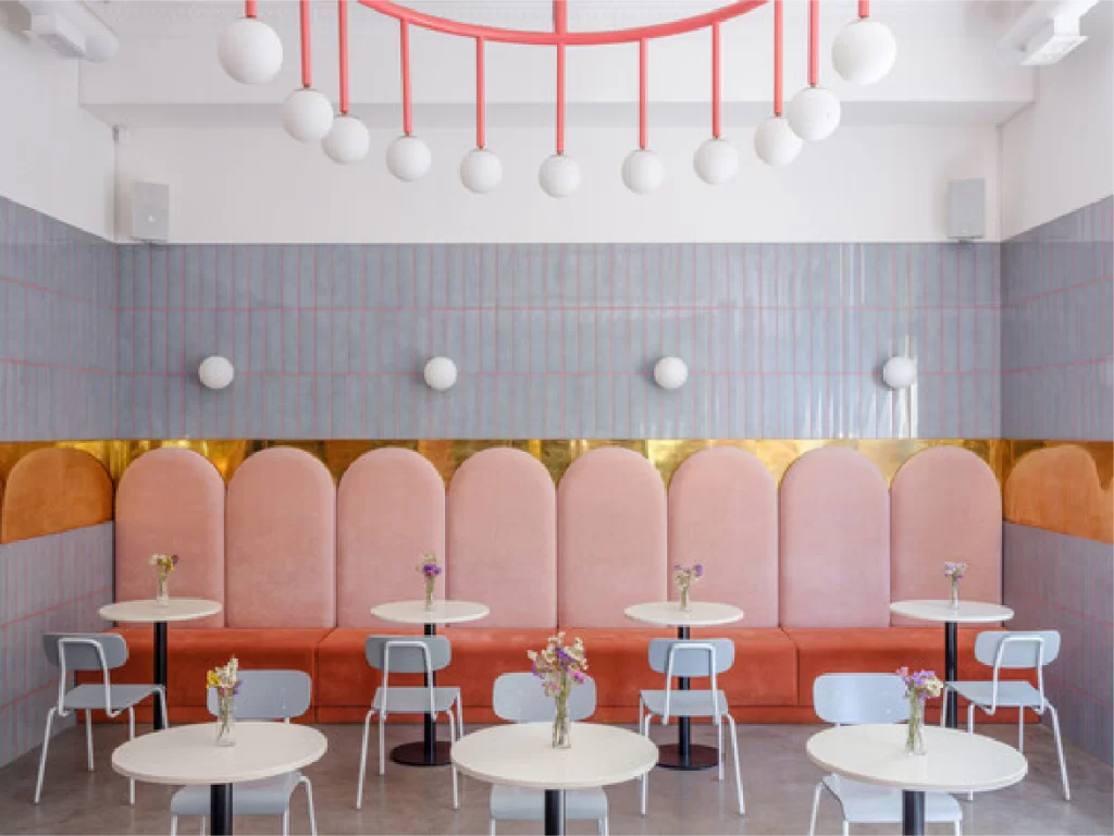
Add a statement piece like a blush velvet sofa, lavender armchair, or pale yellow ottoman. These pastel-colored furnishings create focal points in your space and add a playful yet polished vibe. Choose minimalist shapes to balance the softness of the colors.
3. Layer with Pastel Colors Textiles and Soft Furnishings
Cushions, curtains, rugs, and throws in pastel tones are an easy way to update a space. Try mixing materials—linen, velvet, and cotton—in dusty rose, sage green, or icy lilac to add warmth and texture to neutral rooms.
4. Try Monochrome Pastel Rooms
Pick one pastel color and explore its full spectrum, from the lightest tint to its slightly deeper shade. This technique—called monochromatic decorating—creates harmony while allowing subtle variations in texture and finish to shine.
5. Balance Pastels with Neutrals
Too many pastels can feel overly delicate if not grounded. To prevent your pastel color scheme from becoming too sweet, offset it with white, taupe, or soft grey elements. This creates a clean, modern look while maintaining softness.
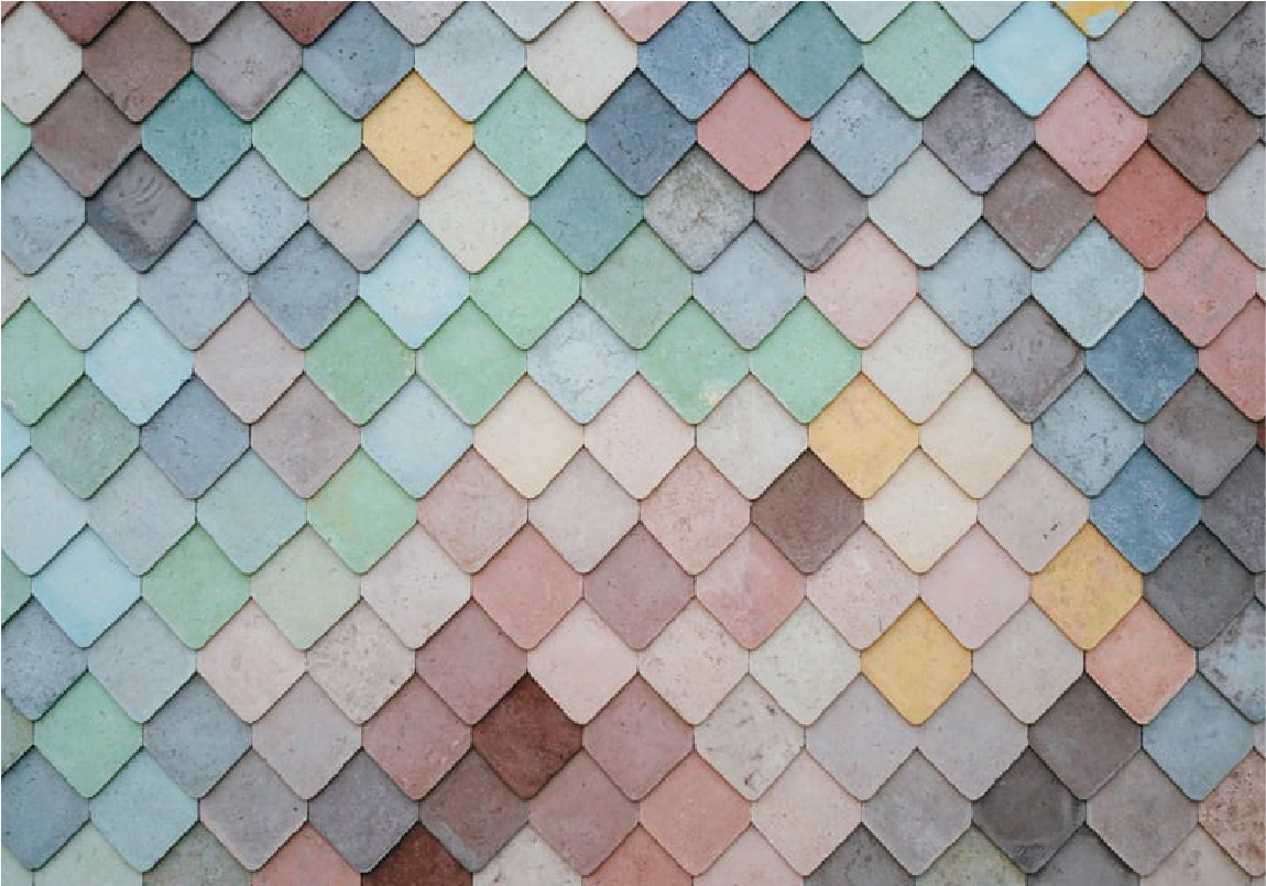
6. Lemon Yellow Rhombus Floor
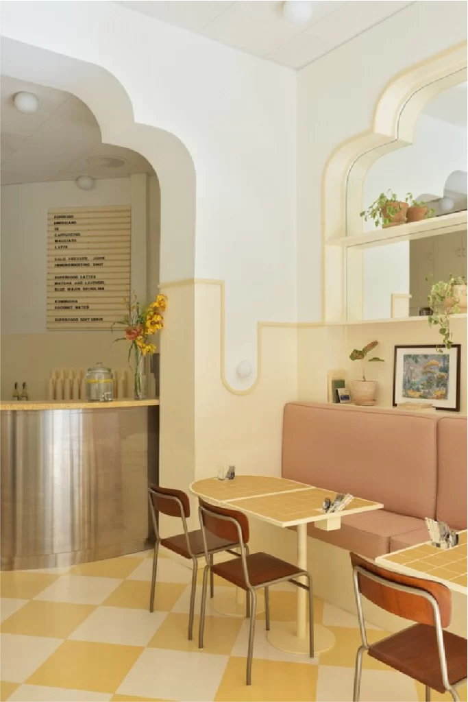
If you’re ready to make a bold yet elegant statement, try introducing a lemon yellow pastel color through patterned flooring. A rhombus tile design in soft yellow not only adds a playful geometric accent but also brings energy to entryways, kitchens, or bathrooms. The pale hue remains soothing while the shape adds a dynamic visual rhythm—perfect for homes that want to blend subtlety with personality.
7. Combining Materials, Textures and Finishes
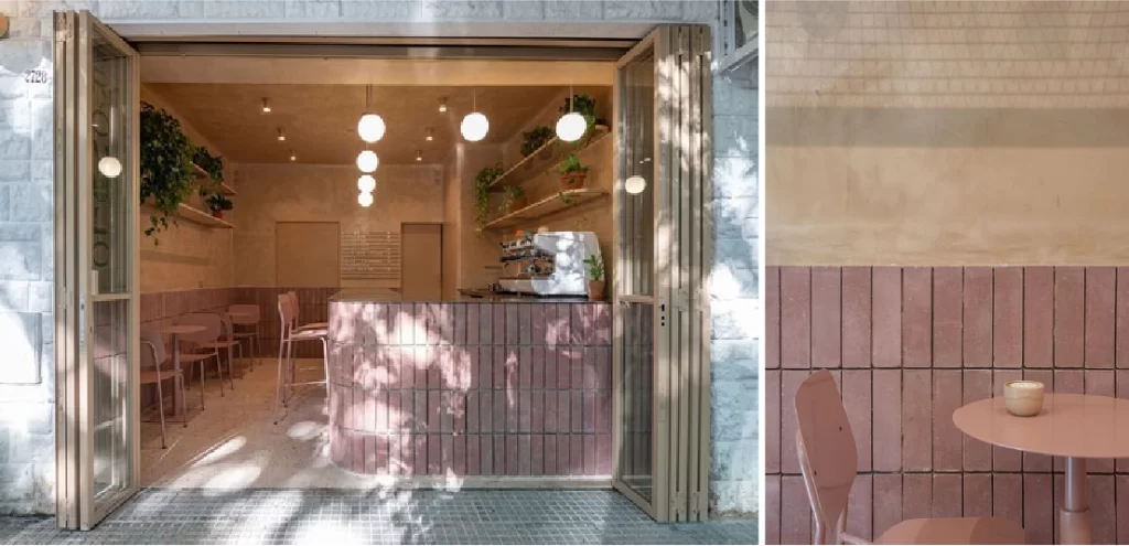
A beautiful way to elevate any pastel color scheme is to play with contrast—not just in color, but in materiality. For example, pairing a matte mint green wall with glossy white tiles, or combining velvet pastel cushions with rustic wood or polished brass. These textural layers bring depth and sophistication to pastel interiors, making the soft hues feel rich and multidimensional rather than flat or overly delicate.
8. Pastel Shades for a Sweet Touch
Sometimes, it’s the smallest pastel color details that make the biggest difference. Incorporate soft pastel tones through decorative accents like ceramic vases, tabletop decor, or pastel-toned tableware. These sweet touches work especially well in kitchens and dining areas, where a hint of blush pink or pale lilac can bring charm without overwhelming the space.
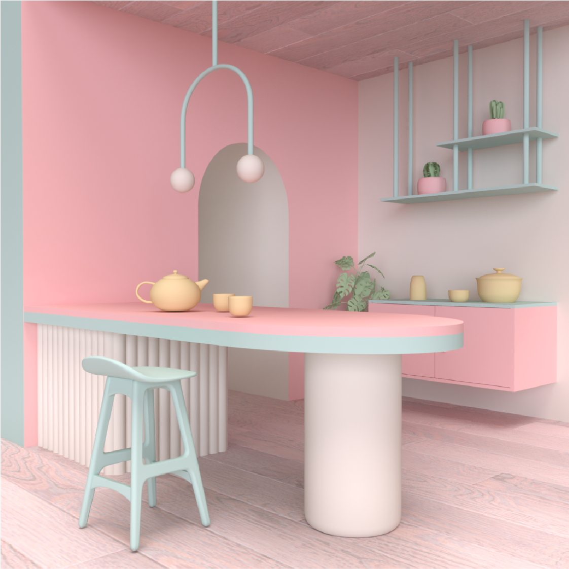
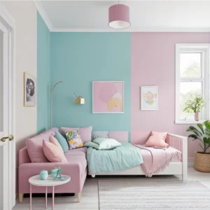
9. Mixing and Matching Pastel Colors
Don’t be afraid to combine multiple pastel colors in the same room. Because these hues share a high white base, they naturally blend harmoniously. Try a combination of lavender, mint, and sky blue in a bedroom, or soft coral with sage and cream in a living room. Mixing pastels gives you a layered look that feels fresh, inviting, and completely unique to your space.
10. Let WeFixPix Virtually Stage with Pastel Color Magic
If you’re selling or renting a property, a beautifully staged photo can make all the difference. At WeFixPix, we offer virtual home staging using pastel color palettes to digitally transform empty rooms into warm, inviting spaces. From pastel-toned bedrooms to soft-hued kitchens, our editing services help your listings stand out with serenity and style—perfect for today’s visual-first market.
Why Pastel Color Design Sells Homes
When it comes to real estate marketing, visuals speak louder than words—and pastel color design is one of the most powerful visual tools for influencing buyer perception. Pastels are more than just pretty shades; they carry emotional and spatial benefits that make them ideal for staging homes, both physically and virtually.
1. Pastel Colors Create a Calming Atmosphere
Pastels are inherently soft and soothing, which helps potential buyers feel more at ease when browsing photos or walking through a space. This psychological comfort can make a home feel more livable, cozy, and welcoming—an emotional trigger that’s essential in the buying process.
2. They Enhance Natural Light
Because pastel colors are made by mixing pigments with white, they reflect more light than saturated or dark tones. This gives rooms a brighter, more open appearance, which is especially important in smaller homes or apartments where maximizing space is key.
3. They Appeal to a Broad Audience
A major benefit of pastel color schemes is their universal appeal. Soft pinks, mint greens, light blues, and creamy lavenders are gender-neutral, non-polarizing, and aesthetically versatile. This neutrality helps buyers envision their own style in the space without feeling boxed into a bold or niche design.
4. They Photograph Beautifully
In the digital age, most homebuyers form their first impressions online. Pastel colors translate well in listing photos—appearing fresh, clean, and stylish across all screens. Whether it’s a pastel-accented bedroom or a digitally staged pastel living room, these tones perform well on real estate platforms, social media, and mobile apps.
5. They Highlight the Home, Not the Decor
A clever use of pastel color allows the home’s architectural features to shine without being overshadowed by flashy styling. The soft palette draws attention to the layout, lighting, and flow of a room—key elements that influence purchasing decisions.
At WeFixPix, we understand the psychology and visual impact behind pastel staging. That’s why our virtual staging services are designed to help you present properties in their best light—literally. Through expertly edited pastel scenes, we help buyers feel a sense of comfort, peace, and connection from the very first click.
About WeFixPix: Your Virtual Home Staging Partner
At WeFixPix, we believe that first impressions happen in pixels. As a trusted expert in real estate photo editing, our mission is to help realtors, developers, and homeowners present their properties in the most compelling way possible—through stunning, professional imagery that resonates with today’s buyers.
One of our most popular services is virtual home staging, where we digitally furnish empty rooms to highlight their full potential. And when it comes to creating soft, stylish, and inviting atmospheres, nothing does the job quite like a pastel color palette.
From blush-toned living rooms to pale blue kitchens and mint-accented bedrooms, our pastel virtual staging options give your listings a serene and contemporary edge. These subtle hues not only elevate the visual appeal but also help evoke emotions of comfort, lightness, and spaciousness—key triggers that influence buying decisions.